Lost in translation
How the ‘want one’ B-King concept spawned the ugly Inazuma

IT can’t be easy to style a motorcycle. Unlike cars, wreathed in body panels and free to come in all shapes and sizes, the shape of a bike is largely defined by technical demands.
Whether it’s the size of the wheels, the angle of the forks, the position of the engine or the slant of the frame rails, it’s all there to make the bike work well first. Looking good is a secondary consideration. And on a naked bike you’ve also got a prominent lump of engine to emphasise or disguise while you’re at it.
While a faired superbike or tourer can skirt around some of the problems, covering the ugliest of the mechanical bits with shapely plastics, naked bikes must be the bane of the stylists’ lives. The best are distinctive and memorable, often trading on being eye-catching and muscular rather than traditionally pretty. The worst are ill-proportioned eyesores. But the line between the two states is often thinner than it first appears.
Seeing Suzuki’s new half-faired GW250S – a bike that scores higher on the ugliometer than most – left us wondering how that awkward, wimpy shape evolved from one of the maddest, baddest, most brutal bikes ever seen; the original B-King concept bike from 2001.
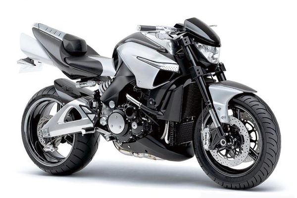
1: B-King Concept, 2001
NOBODY would call the B-King beautiful when it was shown as a concept bike, but onlookers clamoured for the machine to be put into production nonetheless. It was just so brutal.
OK, so the supercharged version of the then-quite-new Hayabusa engine was a big draw, with two-hundred-and-something horsepower, but the looks were stunning as well. The way all the mechanical bits seemed to be squeezed into a concentrated lump in the middle, aided by a headlight set right back between the fork legs, its lens mimicking the shape and angle of the rider’s visor above. Massive tyres (240-section at the back, 180-section front) and those two bazooka exhausts meant it was unlike anything seen before.
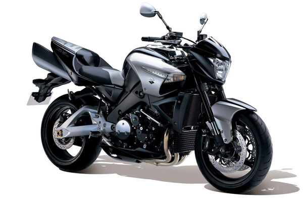
2: B-King production bike, 2007
SUZUKI never expected to make a production B-King. That original concept was eye-candy, designed to draw people to the firm’s 2001 Tokyo Motor Show stand and little else. But the positive response was so strong that a production version was soon on the cards.
It took six years to develop the bike from concept to production, losing the supercharger along the way, and the showroom version never managed the sort of sales that might have been expected given how many people loved the concept.
While the lacking supercharger might be blamed, the real reason for falling out of love with it was that the small tweaks to turn the concept’s shape into a production reality meant it lost the essence that made the concept so desirable in the first place.
The light moved forwards and upwards, as did the bars, watering down the concept’s feeling that they’d been compacted into a single unit with the engine. The seat unit gained chunky supporting brackets, the result being that the ‘visual weight’ of the bike was no longer clumped tightly around the all-important engine but spread along its length. That, in turn, made the over-sized exhausts look too big and cartoonish, as did the fact they sat above a 200-section tyre rather than a 240. Those big pipes made the tyre – the biggest on a production bike at the time – look too narrow. The front rubber was too narrow, too; no doubt the concept’s wide front rubber threw up handling issues. The proddy version’s 120 might have helped that, but because it looked so normal it threw all attention onto the odd-shaped headlight, now prominently high and jutting forward. It was like a supermodel after a bad facelift; the elements were all familiar, but it suddenly became hard to see why you found them good-looking before…
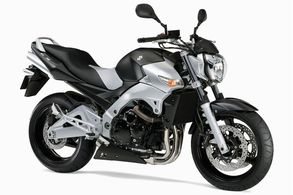
3: Suzuki GSR600, 2006
ALTHOUGH it reached production before the B-King, the GSR600 was clearly derived from the same 2001 concept bike’s styling.
Again, though, in search of practicality the shape was distilled to the point where the desirability went missing.
As on the production B-King, it was the proportions that went awry, albeit not so badly on the 600. Ditching the oversized exhausts in favour of MV-alike quad under-seaters was a good move, helping the relatively narrow rear tyre remain in proportion, but the big seat unit – needed to give pillion capabilities and a dose of practicality – meant there was little sign of the mass-centralisation that was so fundamental to the original idea. Again, the headlight retained elements of B-King in its vertical-fronted profile, but the loss of the visor-like shape meant there wasn’t a ‘face’ anymore. Where the B-King concept looked like a robot warrior from a sci-fi movie (if ever there was a bike that should have appeared in the Terminator franchise, that was it), the GSR600 had all the menacing intent of a Moulinex food processor, which is sort of what the headlight looked like.
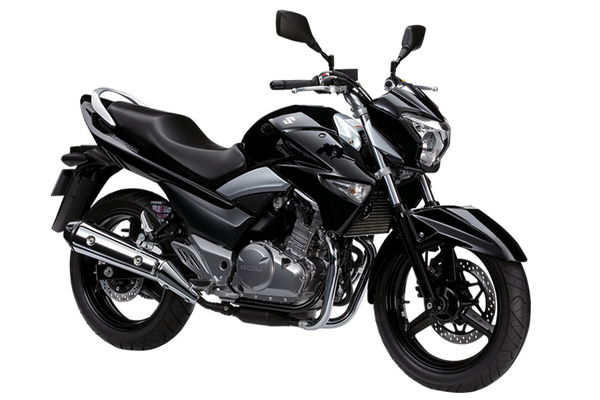
4: Suzuki Inazuma, 2012
THE GW250 Inazuma looks like a bike that was designed via a game of Chinese whispers; as though instead of drawing a picture of what it should look like, the stylists described the B-King to the production team over the phone. And ran out of credit before they got round to explaining what the back should look like.
The headlight looks like that of the B-King production bike, itself a shadow of the original concept, and the front indicators are clearly inspired from the same source, as is the wedge-shaped mudguard. But the proportions have gone entirely at this stage. Looking at the profile, the bike looks back-heavy where the original B-King idea was to focus the weight towards the front. There’s a big gap behind the front wheel, where you want to be seeing a powerful engine, and there’s no space at all above or in front of the rear wheel, the area where good-looking bikes often have open areas to emphasise a nose-down, front-heavy stance.
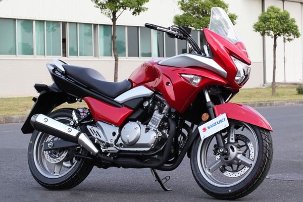
5: Suzuki GW250S, 2013
The new, faired version of the Inazuma manages to virtually eliminate all remaining ties to the original, desirable B-King concept, retaining only a smattering of styling elements applied in such a way as to make the result verging on the repellent.
The forward-tilt to the headlight is still there, as are the indicators blended into the sides, but if you sat the GW250S next to the B-King concept that Suzuki unveiled a dozen years ago, you’d be hard pushed to find the parallels.
Shame. The original B-King was arresting, original and – as we’ve clearly seen – influential. Perhaps it would have been better had Suzuki left us with just memories of the concept.
Can you name any other concepts that have evolved from marvels to mingers? Or any bikes that started as ugly ducklings and developed into swans?


